
We're big fans of iOS 7, but it's not perfect. In this video we discuss our pet hates in iOS 7, and the things we hope Apple changes when it reveals iOS 8 this summer.
For all the rumours about iOS 8, check out this article:
And for the 7 things we love about iOS 7, take a look at this video:
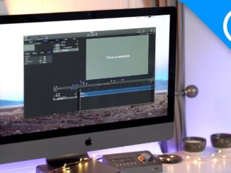

before you start let me list the things. i paused the video at 0.05m
paralax, icons, ui is too flat, no design, siri ui looks awful, looks more
like android, flat design with no style like steve jobs said windows has no
style, this is what happened to ios 7, jony ive is not good at designing
software, let him do what he does best, disigning the products, not
software. the icons that fall animation is weird. hope that is enough for
you
news stand should show what magazines are in it sort of like apps in
folders, and there are many apps you can’t delete on ios. they should make
ibooks default app that you can’t delete on ipad.
I love IO7 cause when your cache files greowing like crazy and you are
running out of space keeping the history of facebook pictures, media and
instagram and so on…you can simply clean it with one click! thanks! apple
Damn that email count!
The first 3 points are so none issues.
This video should be called “7 Things Apple Wont Change in iOS”
Too many “uhm”s. It is really annoying. Nearly every sentence has an uhm or
two, if not more. Taking a little break to collect your thoughts is fine,
but don’t uhm all the way through.
um
um
um
um
um
um
um
um
um
um
um
um
um
um
um
um
um
You know you can “hide” default apps, right?
No you can’t
yes you can in restrictions
I agree and disagree with most of the points here, firstly though none of
these are really ‘hateable’ things, but if you want the opportunity to
delete the pre installed apps then you could argue they don’t take any
space away from the original memory size, but as well, it would be better
to have some of the stocks or particularly the weather app back for iPads.
You can’t call the colour of the app icons a hate either its simply an
artistic disagreement between apple and what you think looks, good the
white backgrounds arguably gives it a cleaner more sophisticated look to
the system, and the keyboard isn’t that bad and autocorrect isn’t either,
it can still work out what I am typing and if it is such a big issue then
why didn’t you go android?! Like you said the design of it hasn’t ever
really changed, and with maps and if you open a document or something in
safari, which isn’t that bad of a browser, you can choose whether to open
it in iBooks or pages, whatever else you have installed! Sorry if its a bit
of a rant but that’s what misleading titles deserve!
i hate the music app on ipad with a passion, its jumpy looks stupid and
what annoyed me is that when you want to view albums, its a list now rather
than the grid layout like itunes
Newsstand it supposed to be like that, when you open it, its like going to
another app screen, and you are reading about all the apps. So when you
close them it takes you back to the “main” screen.